Designing For Doctors
THE PROBLEM
DeVry owned a platform that supplemented coursework for medical students. The system had an outdated design, likely causing the low adoption rates.
THE SOLUTION
To recreate this platform, I headed research into the design and flow of the web portal, app design, and art direction. Analyzing the data, I worked with artists and developers to redesign the experience for over a year.
Project Results
REVIEW SCORE
+56%
COURSE COMPLETION
+23%
RETENTION
+37%
USERS RESEARCHED
2,419
THE PROCESS
Since the platform was pre-existing, it was important to dissect and research how people were currently using it. From there, we could analyze pain points for the experience and build out a fun, enriching flow, demonstrated and developed through iterative prototypes.
1. RESEARCH
2. ANALYSIS
3. REDESIGN
4. PROTOTYPE
DRIVING QUESTIONS

How do students navigate the app?
Where are students quitting or closing the app?
What do students most enjoy about the app?
What pain points exist in the flow?
How does the web portal translate to the app?
Is all of the UI clear and understandable?
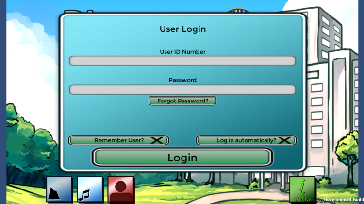
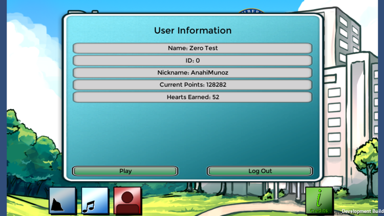
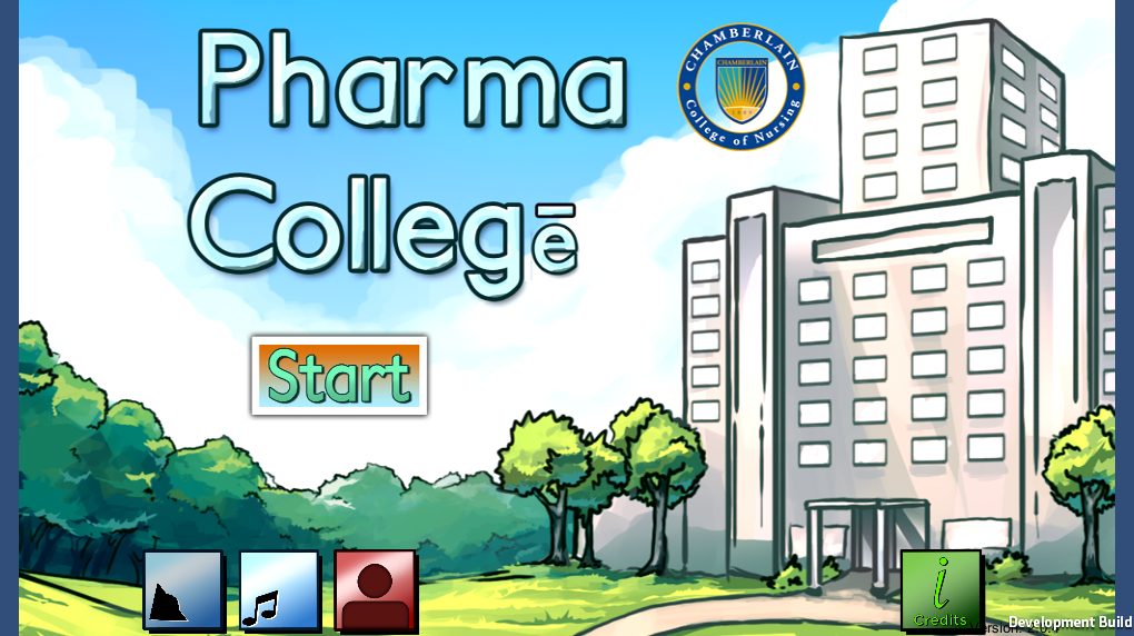
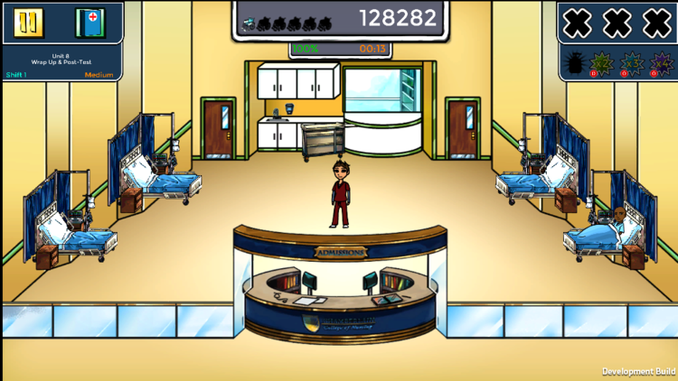
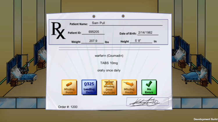
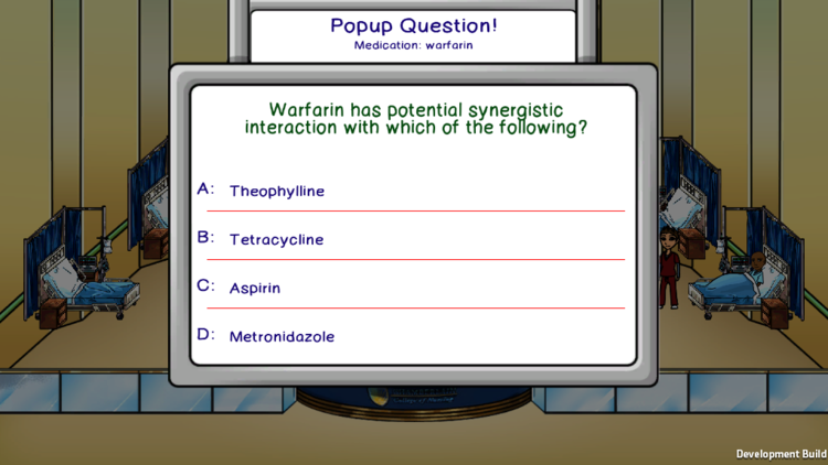
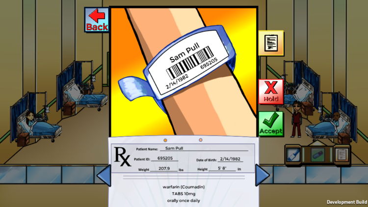
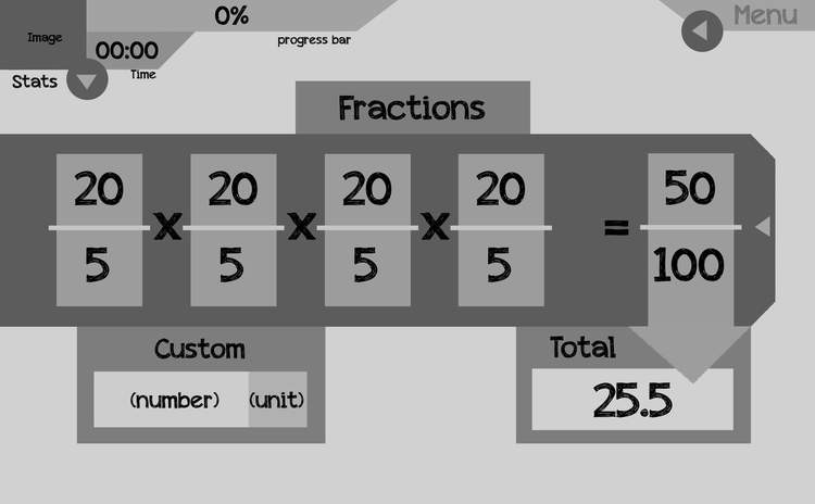
MEDICAL SIMULATION
PHARMA COLLEGe

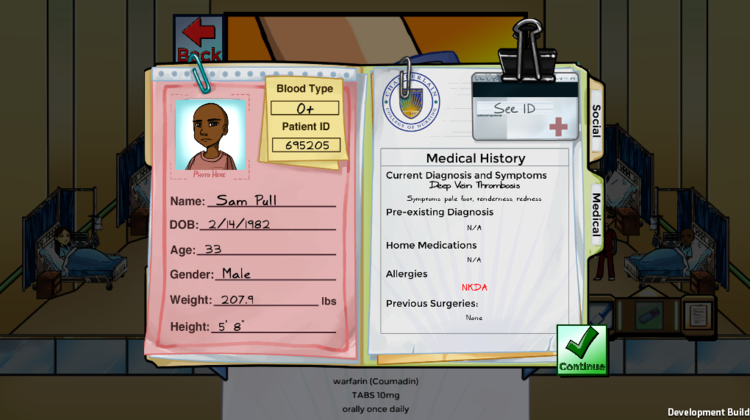
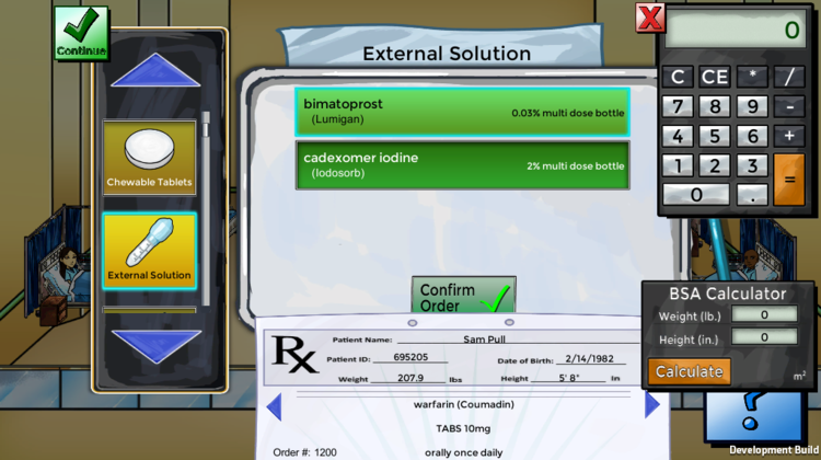
HEURISTIC ANALYSIS
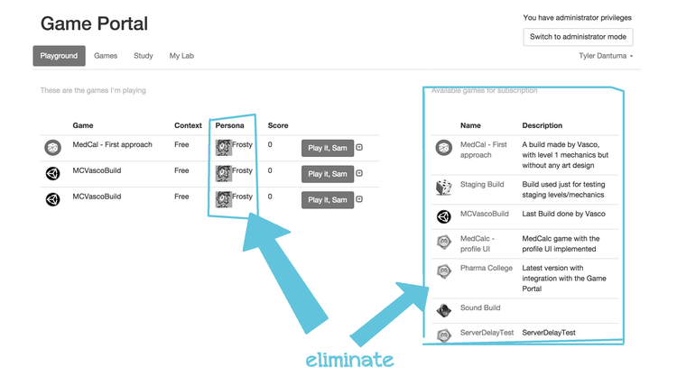
DEVRY WEB PORTAL

DISCOVERIES
CLARITY OF UI
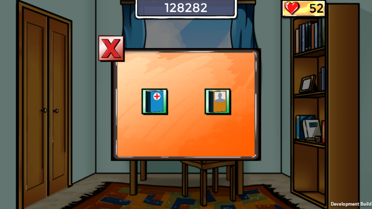
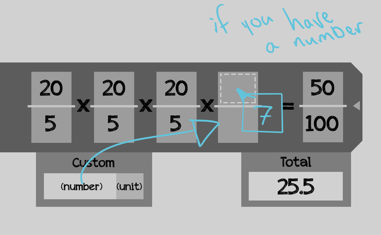
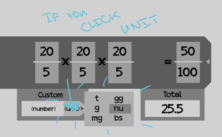
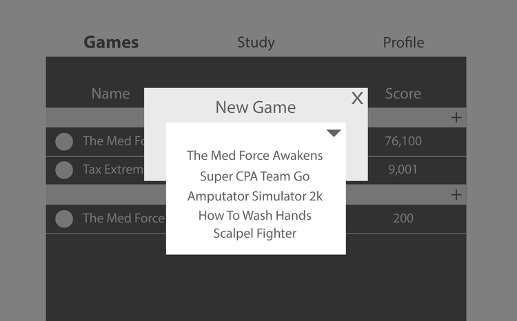
Many of the UI elements took assumptions about users understanding what buttons meant. Especially because the icons were so small, it became hard to discern what exactly a button was or did.
Without words to give context, it's unclear in the example to the right what each of those books are or where they lead.


OUTDATED ART STYLE
The styling on the buttons was a gradient, outlined style that was very dated, making the buttons hard to read and unappealing.
There was no direction for color palette or app brand/style, leading to many colors that clash or compete for attention.
The style of the art was very childish, and made mid-late 20's university students feel like they were playing a children's game.
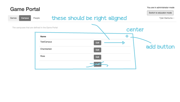
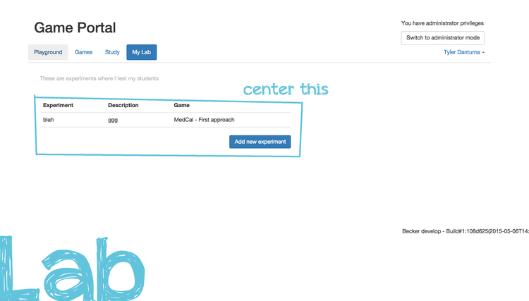
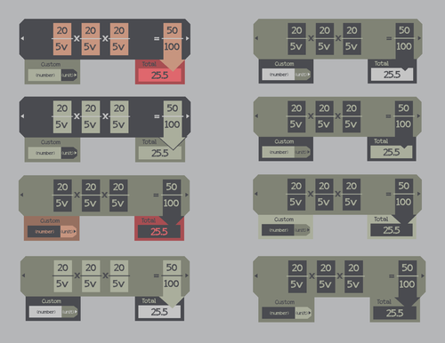
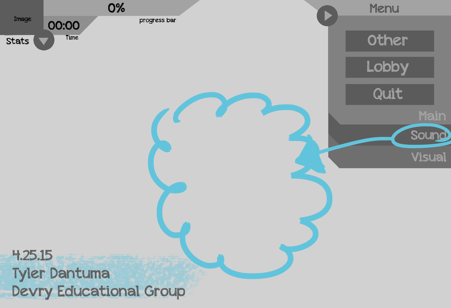
DESIGN INCONSISTENCIES
Without a clear design system, the placement and organization of elements on the screen dragged a users eye all over the page.
For example, there is no reason for the cascading menu on the right to continually indent, and the two differing styles for modules to interact with confuse the user as to their subfolder-type structure.

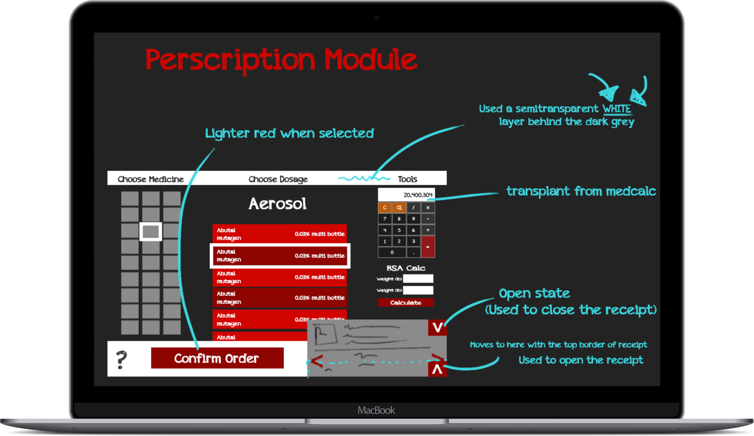
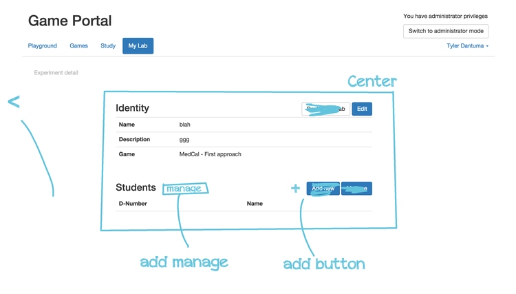
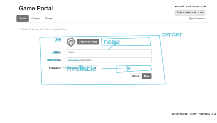
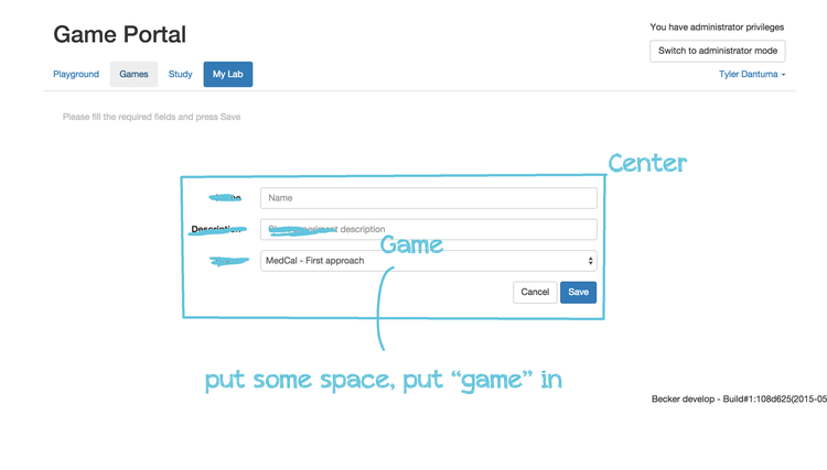
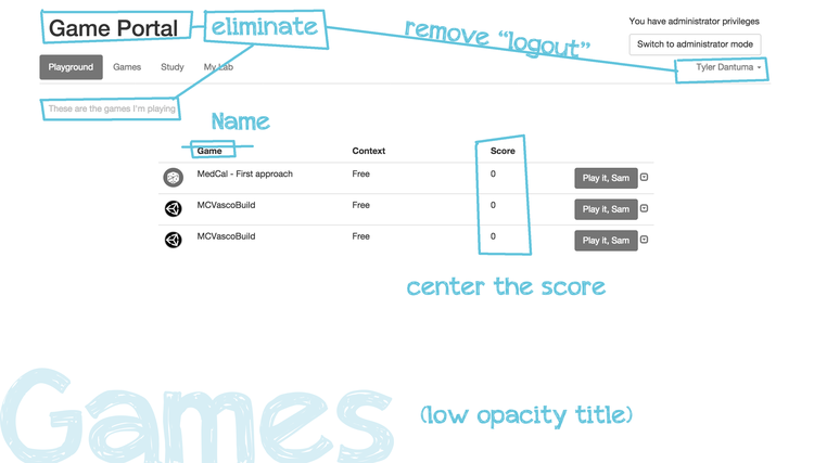
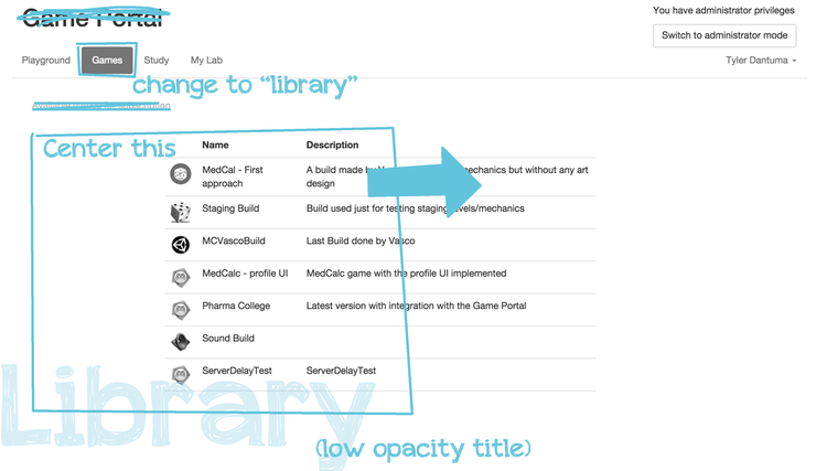
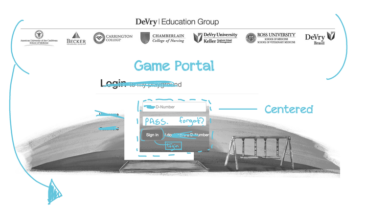
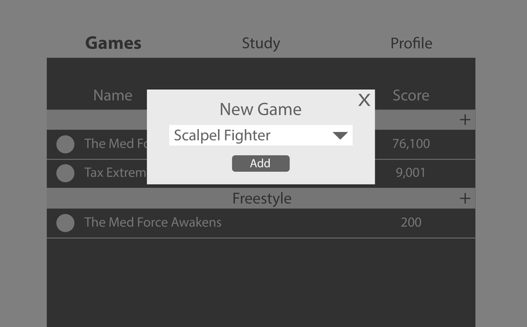
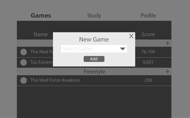
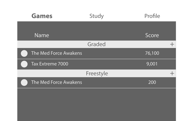
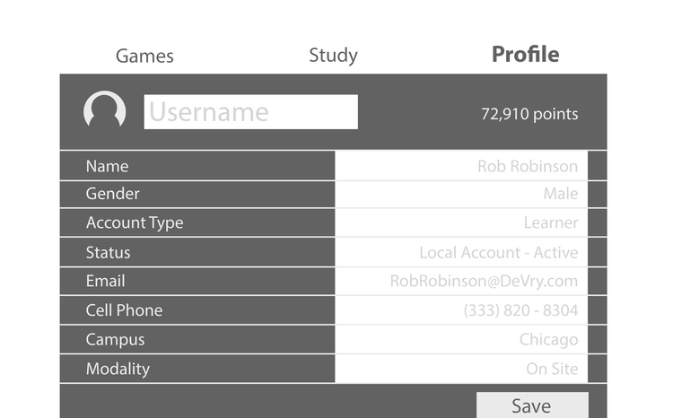
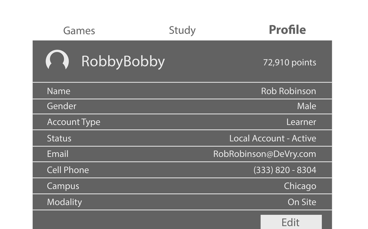
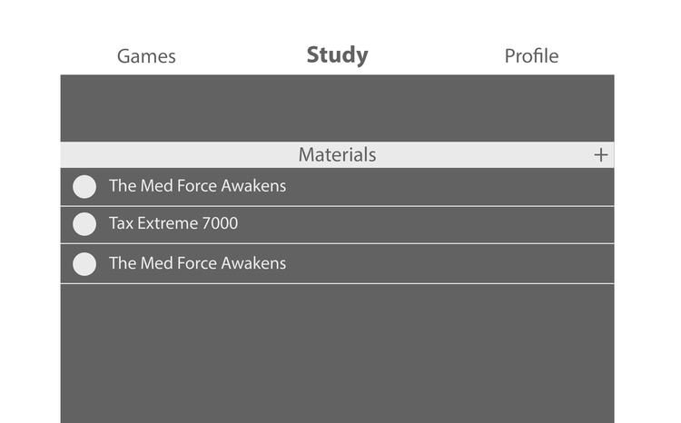
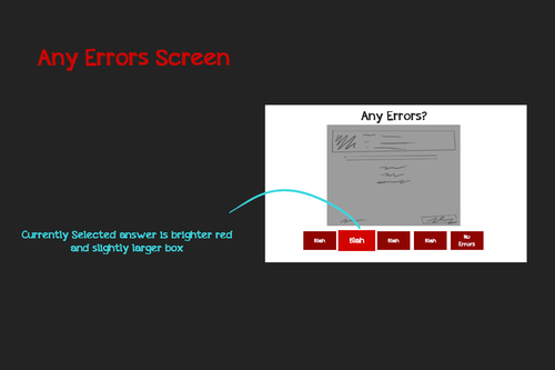
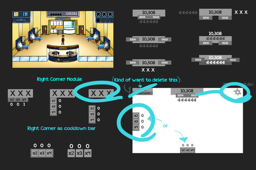
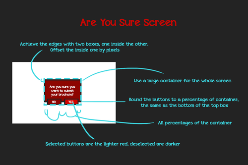
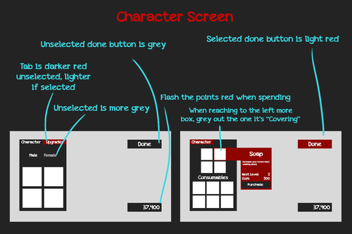
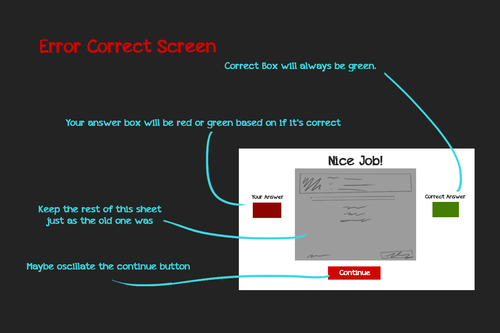
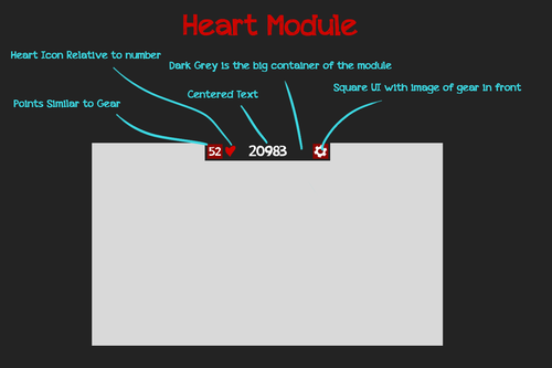
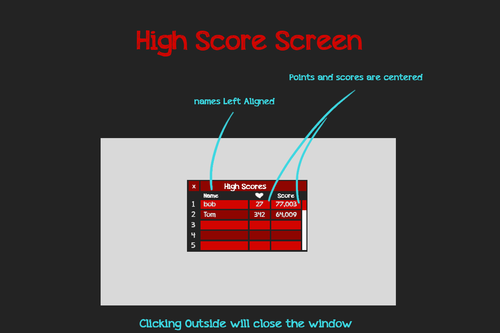
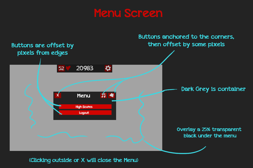
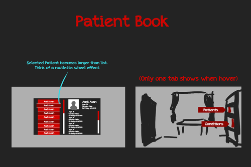
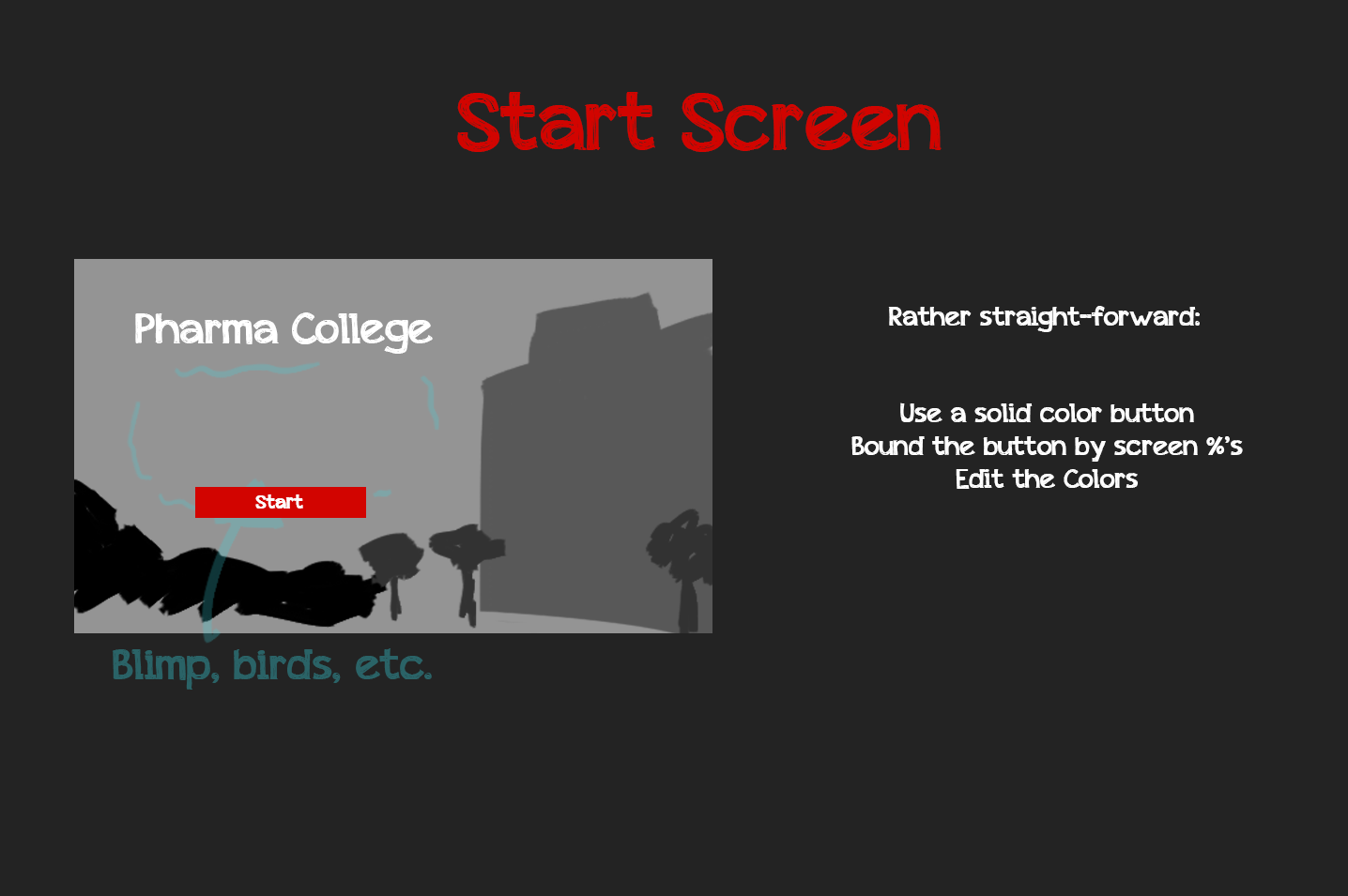
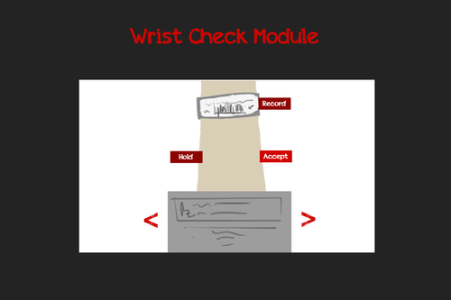
WIREFRAMING
Now that we'd identified the paint points and challenges of the experience, we used the discoveries to fuel the sketching of wireframes to redesign the experiences of multiple digital touchpoints. Below are a few of the wireframes for selected modules of the design.
DA Framework
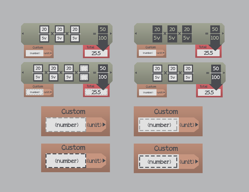
Menu Design
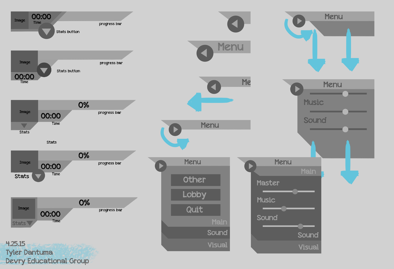
Web Portal

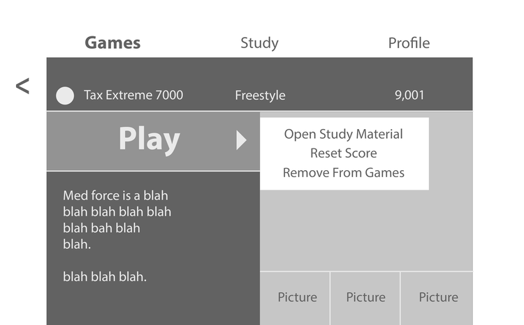
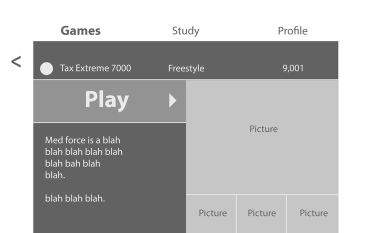
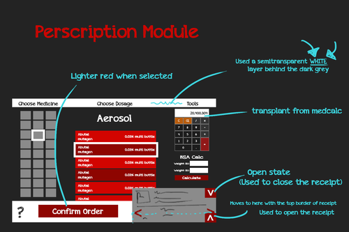
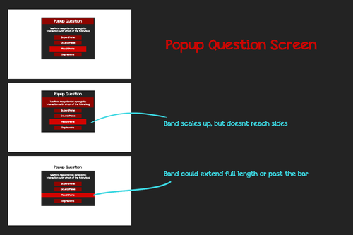
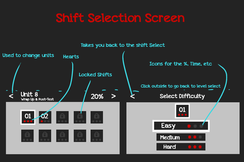
PROTOTYPE AND TEST
EXPLORATION AND ITERATION
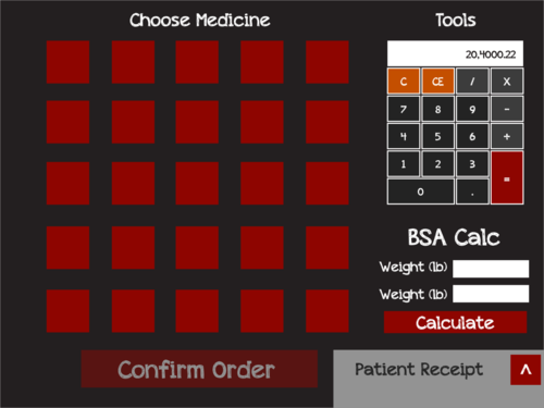
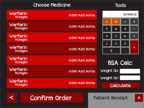
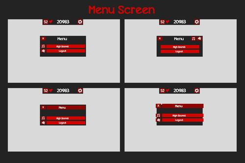
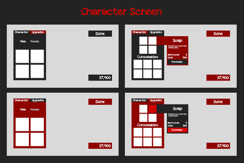
The final step was to refine the proposed wireframes, based on user testing and research. Accompanied with these were explanations of design decisions and interactions between UI elements.
These mocks grew out of discoveries with usability testing, focus groups, and A/B testing. We continued to test and iterate even as the design and development process continued.
FINISHING MY PART IN THE PROJECT
CONTINUED EVOLUTION
At the end of my part in this project, we'd completely redesigned multiple platforms, including the Web Portal, the PharmaCollege experience, and the MedCalc experience.
We saw increased utilization of the course supplements, as well as higher review scores for the students and a slight increase in grades.
Each platform continues to evolve today, thanks to systems and design decisions I made during my time there.
I'm very proud of the product my team built, and it was an honor to collaborate with such talented, driven professionals from across the globe.
See below for a single-page digest of the project overview: