THE PROBLEM
Treba is an outdoor supply company that offers high-quality products in retail locations as well as online. They were looking to re-engage their repeat customers and appeal to a wider audience, after recognizing a loss of customer engagement in the form of stagnating sales.
THE SOLUTION
Included in this design process were multiple drafts and stages of designs that showed completely different options for the client to choose from, eventually leading them to realize they loved a style they didn't initially expect to want.
PROCESS
Included in this design process were multiple drafts and stages of designs that showed completely different options for the client to choose from, eventually leading them to realize they loved a style they didn't initially expect to want.
FIRST STEPS
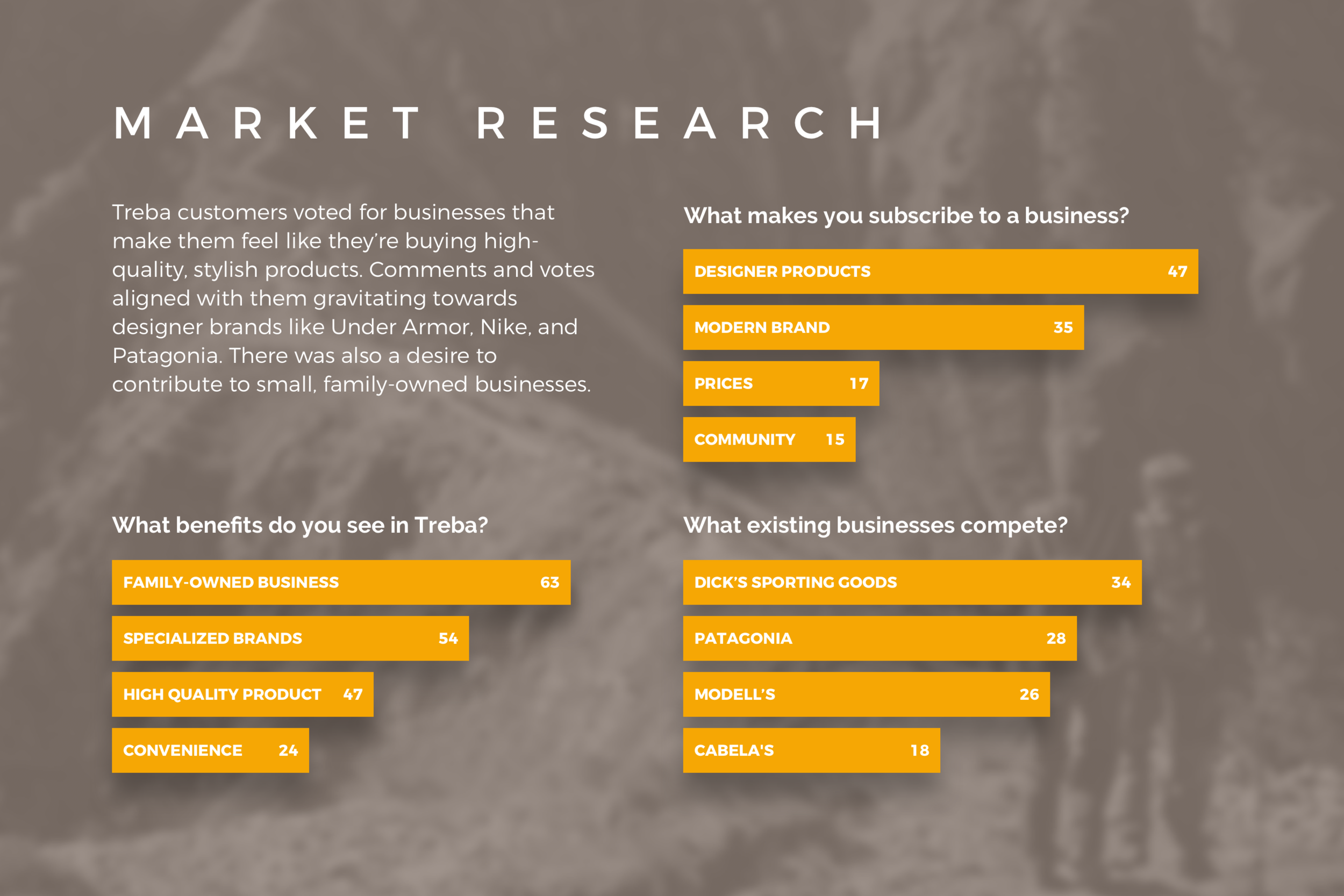
Being a family-owned business, Treba put high value into focusing on active families as customers, and wanted their brand to reflect that. We conducted on-site market research at three of their stores, giving insight into the motivations of their target audience.
MARKET RESEARCH
Treba customers voted for businesses that make them feel like they’re buying high-quality, stylish products. Comments and votes aligned with them gravitating towards designer brands like Under Armor, Nike, and Patagonia. There was also a desire to contribute to small, family-owned businesses.
DISCOVERIES
HIGH QUALITY FOR FAMILIES
Analyzing the data from the market research led to three important discoveries for the direction of the brand and solution we were building:
Both the customers and the business owners valued family-focused products, so the brand and subsequent materials needed to reflect an active-family lifestyle.
Customers felt the products were old and outdated, leading to the conclusion that a modern, stylish approach was appropriate.
The current branding and product marketing didn't exist in modern media formats. The logo, brand standards, and marketing materials needed to be brought up-to-date.
Competitors had simplistic, straightforward design that centered around their logo and brand.
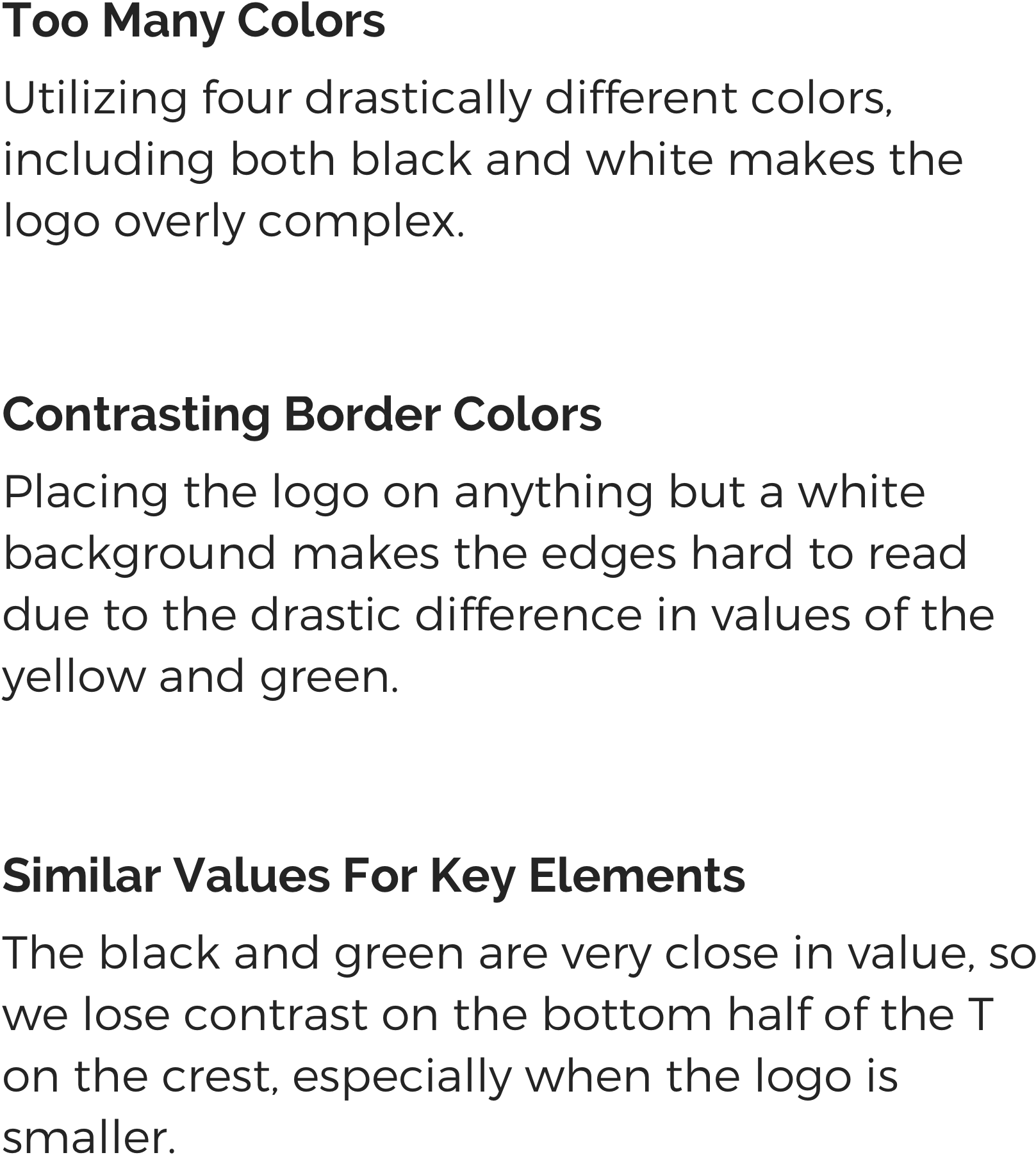
LOGO REDESIGN
BRAND IDENTITY
In the interests of establishing a brand identity, I created a composition of products that the website would sell, each overlaid with the company colors. This allows the customer to get a feel for the essence of their brand, and for designers to have a sort of blueprint for aesthetics.

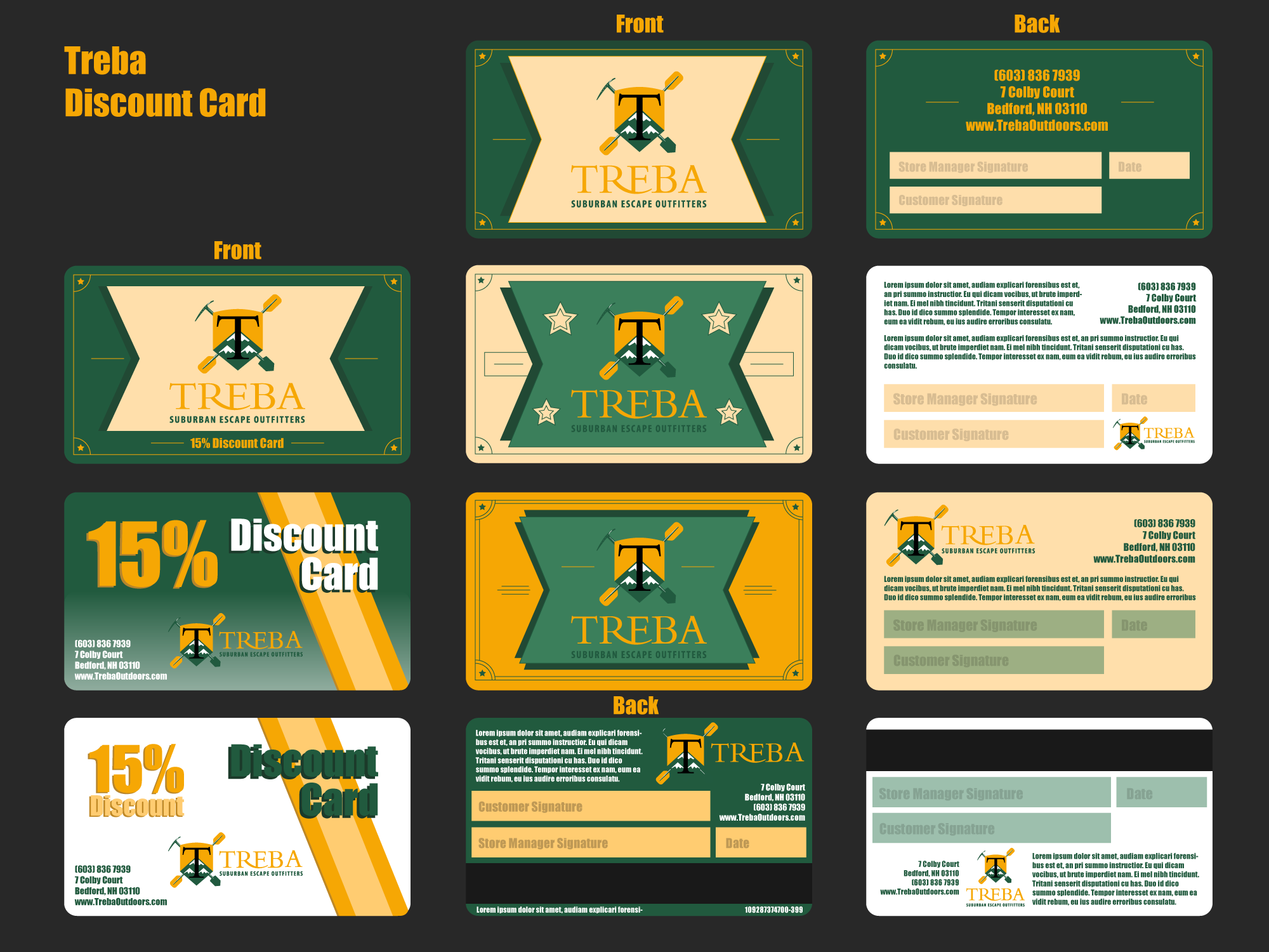
ITERATION AND OPTIONS
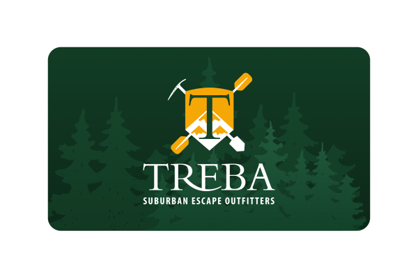
The initial customer desire was to mimic a gift card from a local home supply store, but that card itself was very outdated. It was important to show the customer what they wanted, along with what I would propose would be a successful utilization of their brand. This way, they could see the contrast of what they thought they wanted versus what would solve the challenge they faced.

CUSTOMER FEEDBACK
They were very stricken with the desired and suggested designs, and immediately saw the value in the newer, modern design. With their approval, I explored more designs along their favorite choice, leading to a final design sheet with options that captured the needs of the challenge at hand.
FINAL DESIGN SHEET
PRESENTING THE IDEA
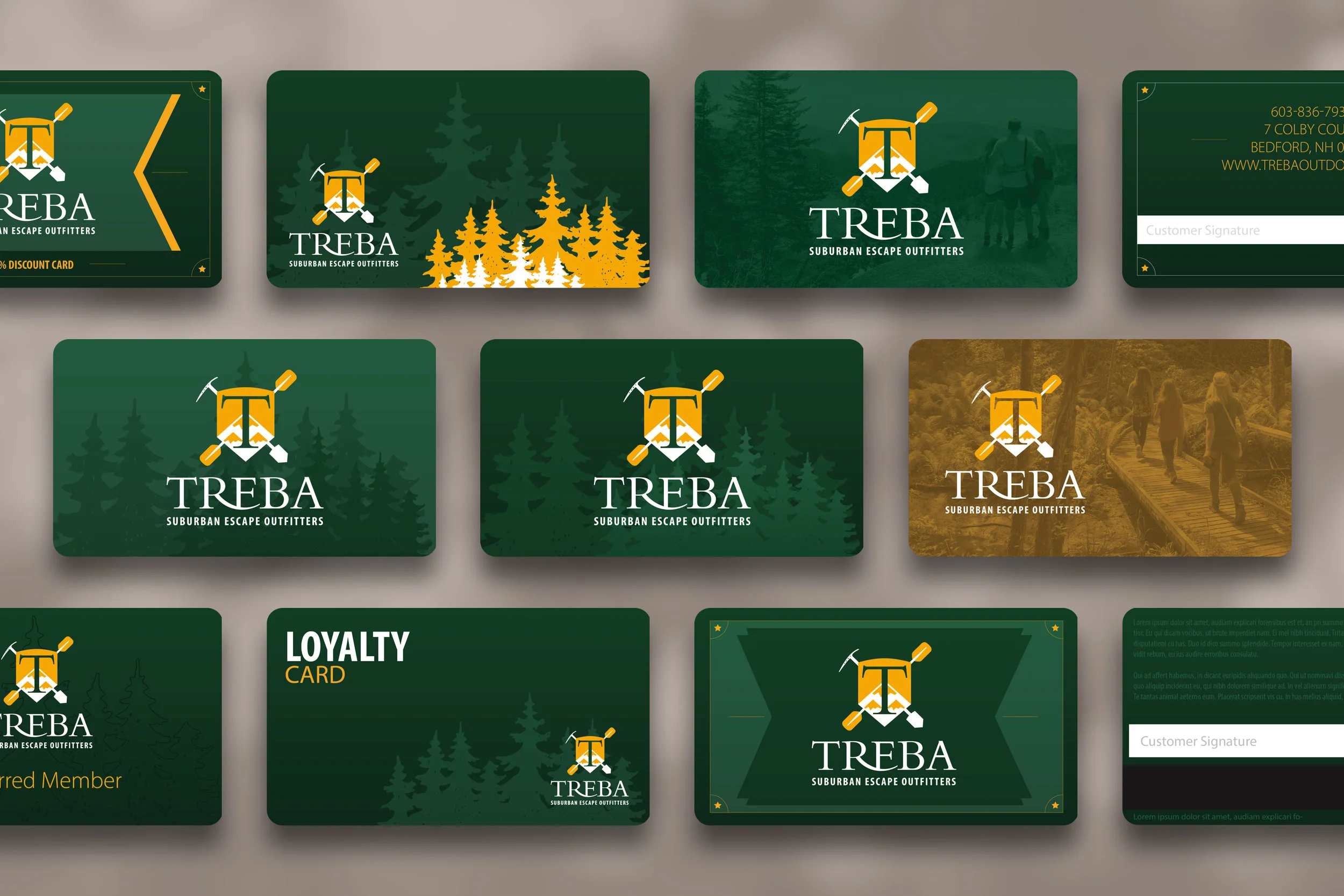
FINISHING THINGS UP
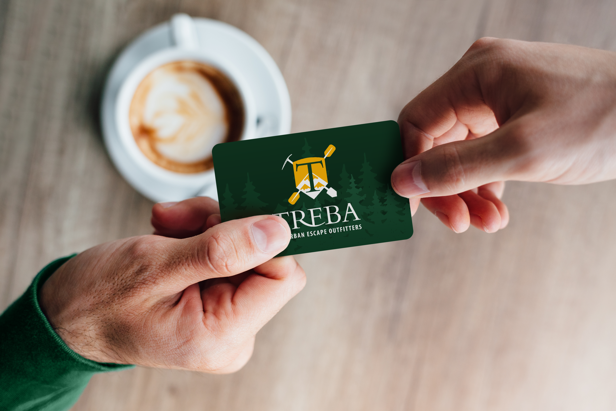
After bringing the previous mocks to the business owner, they gravitated towards the centered, simplistic design featuring the outdoors. They loved the redesign of the logo, and began rebranding their retail location, focusing on the targeted color scheme. A few supplementary marketing materials were provided to the business to market their new loyalty card on social media, in store, and on their website.