Modernizing Martial Arts
The Problem
The American Kyuki-Do Federation is a national collection of martial arts schools teaching a variety of styles to thousands of students. They were looking for a way to engage with customers and bring their business into the 21st century.
The Solution
I led a collaborative project to conceptualize a cohesive web page and app through a challenging crossroads of marketing, design, and user experience.
The Process
I wanted to research the people I was designing for, as well as the values of the business. I took those personas to establish their needs, which informed the user flow. Once I worked out a design that satisfies those needs, I sketched a wireframe of the app and a hi-fi concept for the user interface.
1. RESEARCH
2. CORE NEEDS
3. USER FLOW
4. PROTOTYPE
DRIVING QUESTIONS
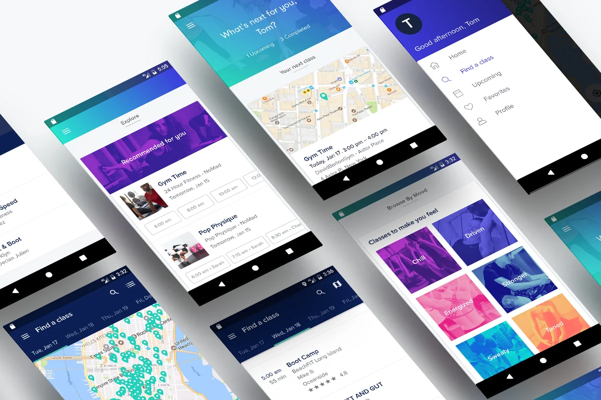
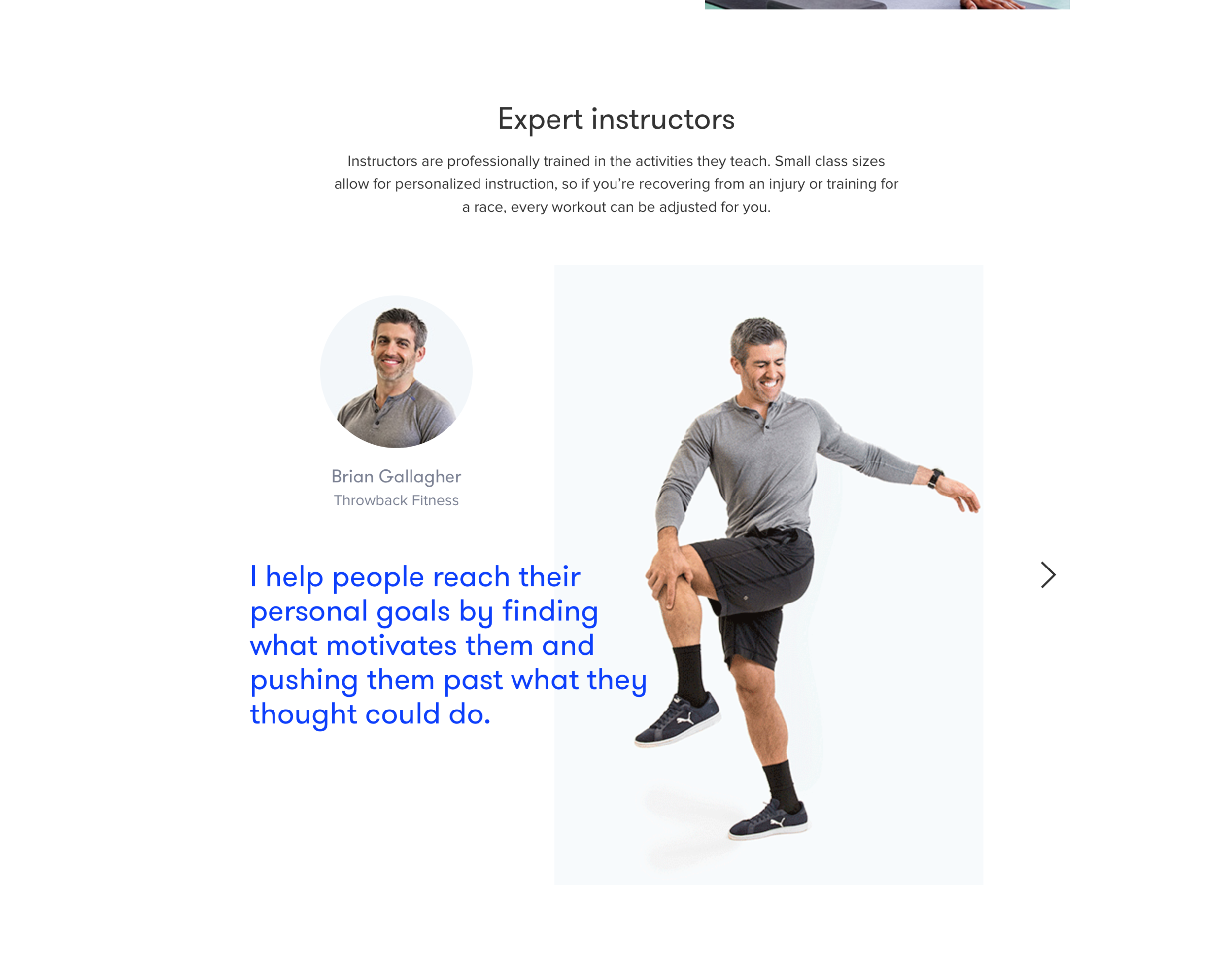
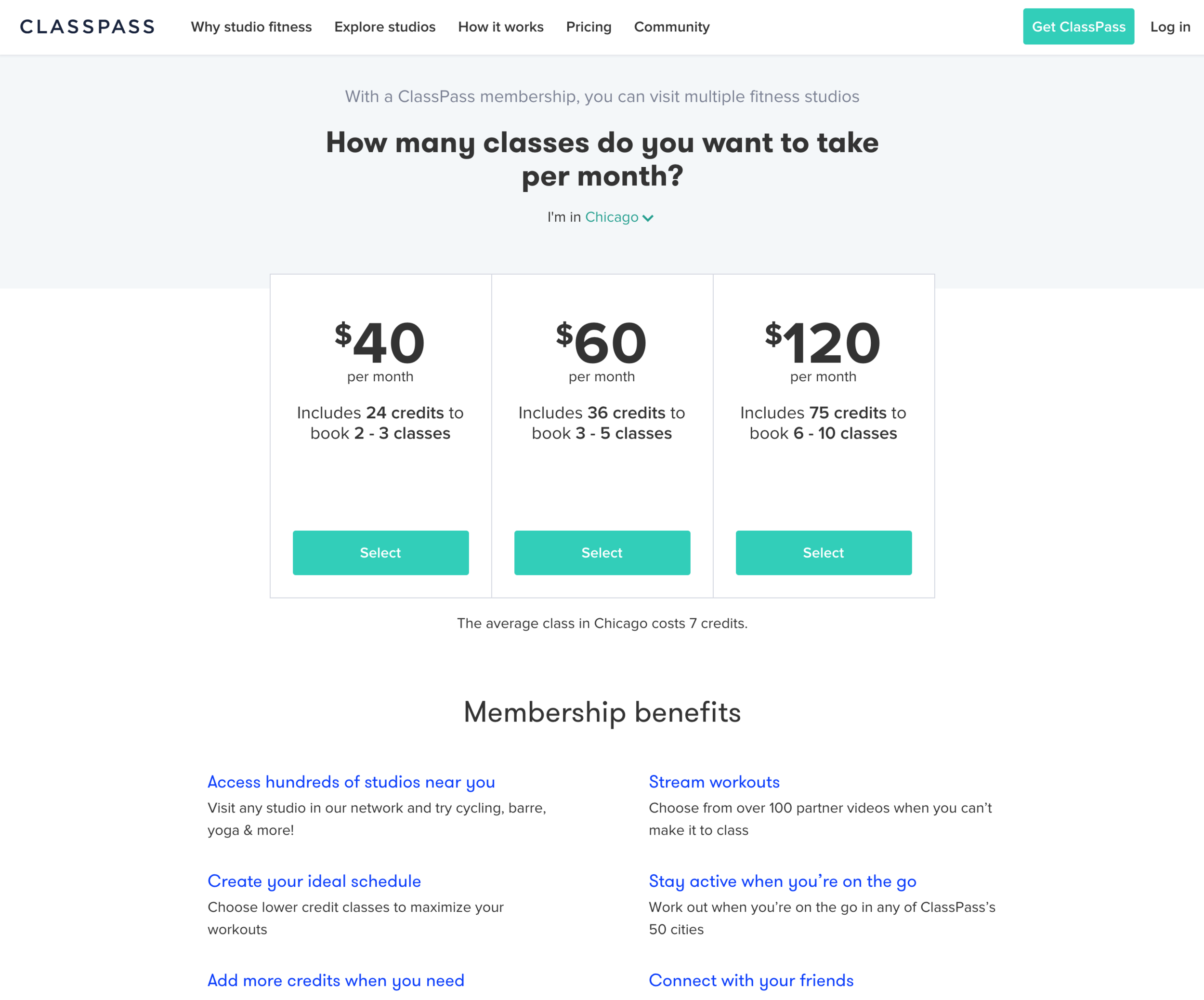
Competitive Analysis
How do they distribute their products/services?
What are the characteristics and needs of their ideal customers?
What are the differentiating features?
What do their customers like about their business?
What marketing strategies have they employed in the past?
How is their service better/worse than ours?
What do they offer their customers?
What do their customers struggle with?
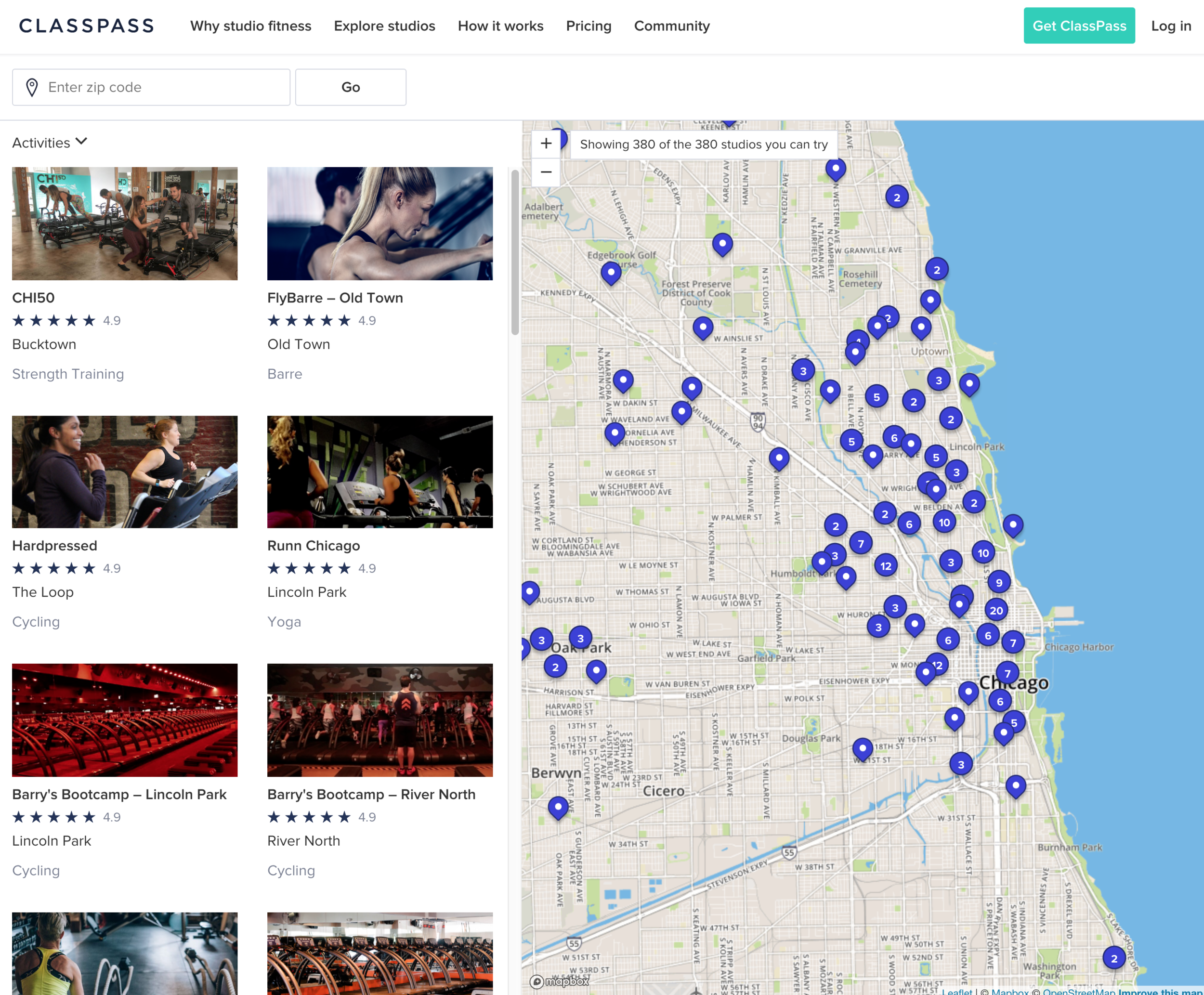
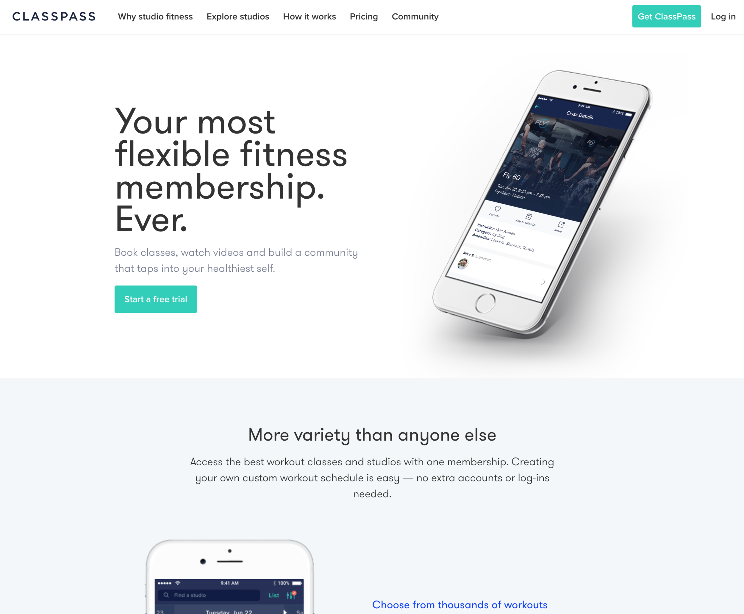
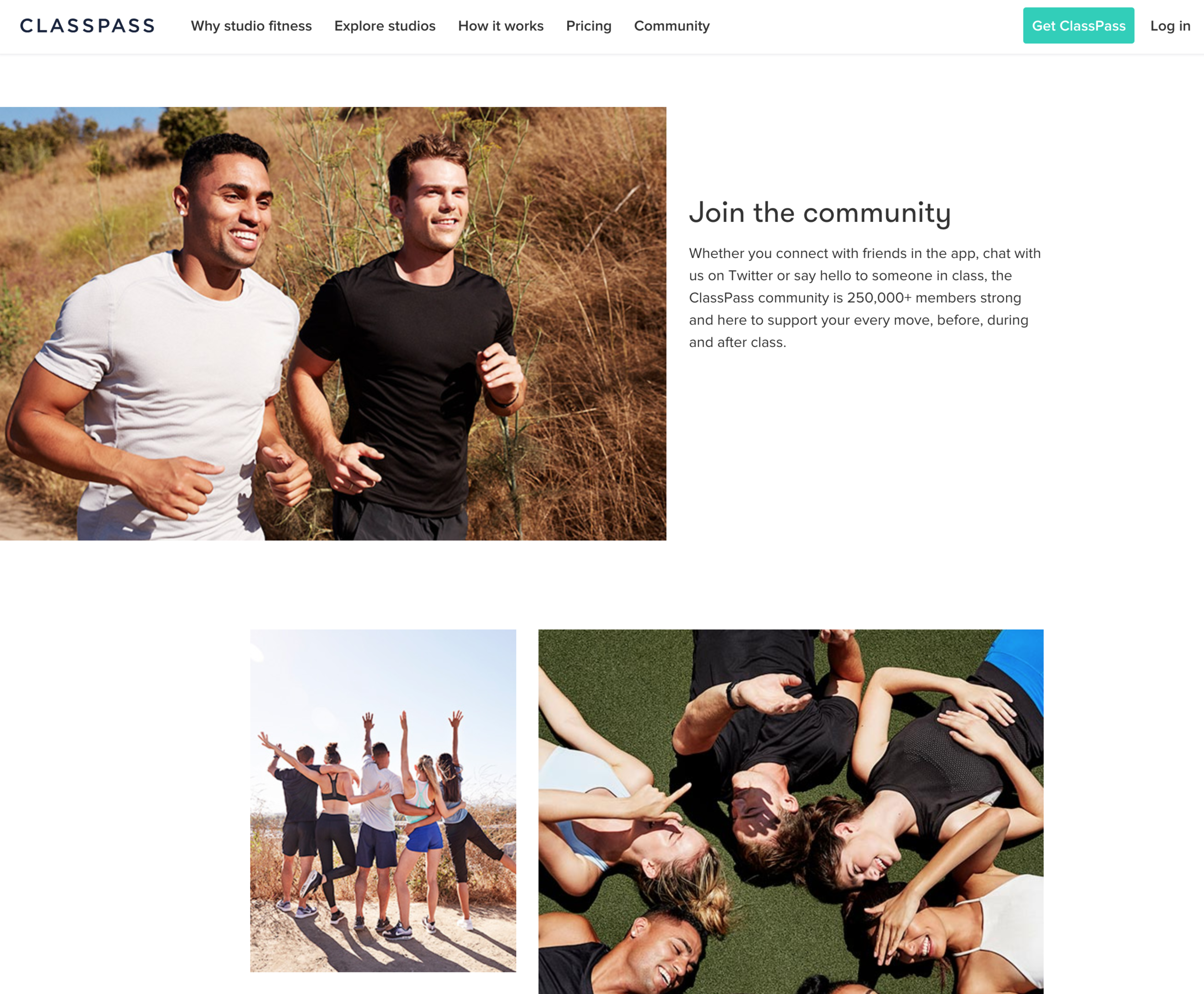
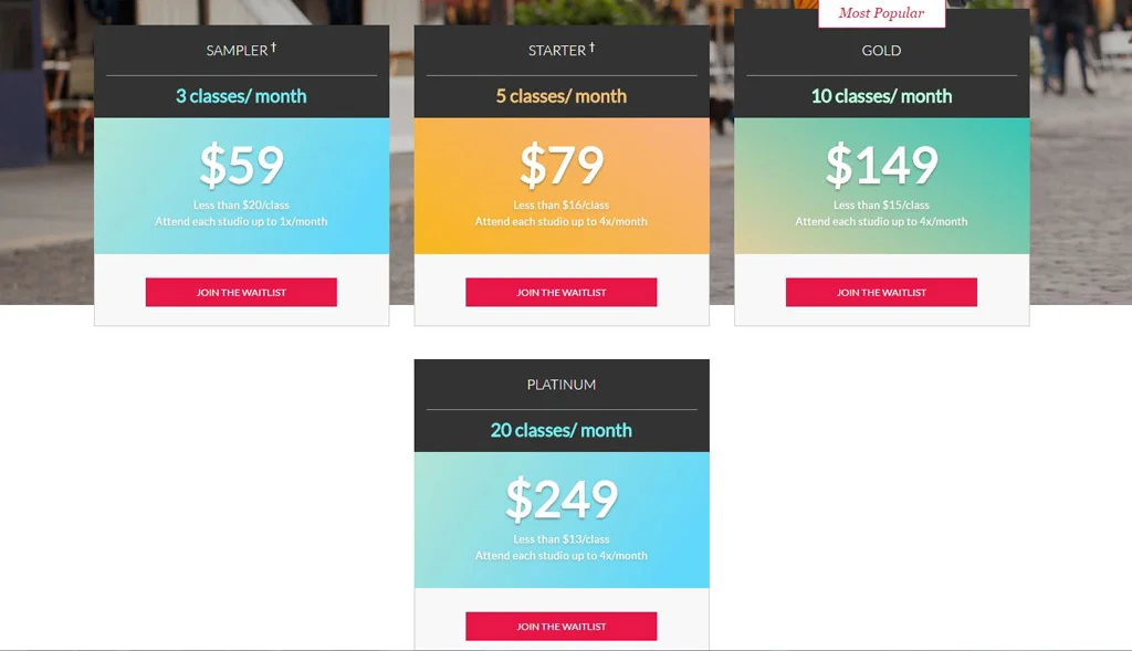
FLEXIBLE FITNESS
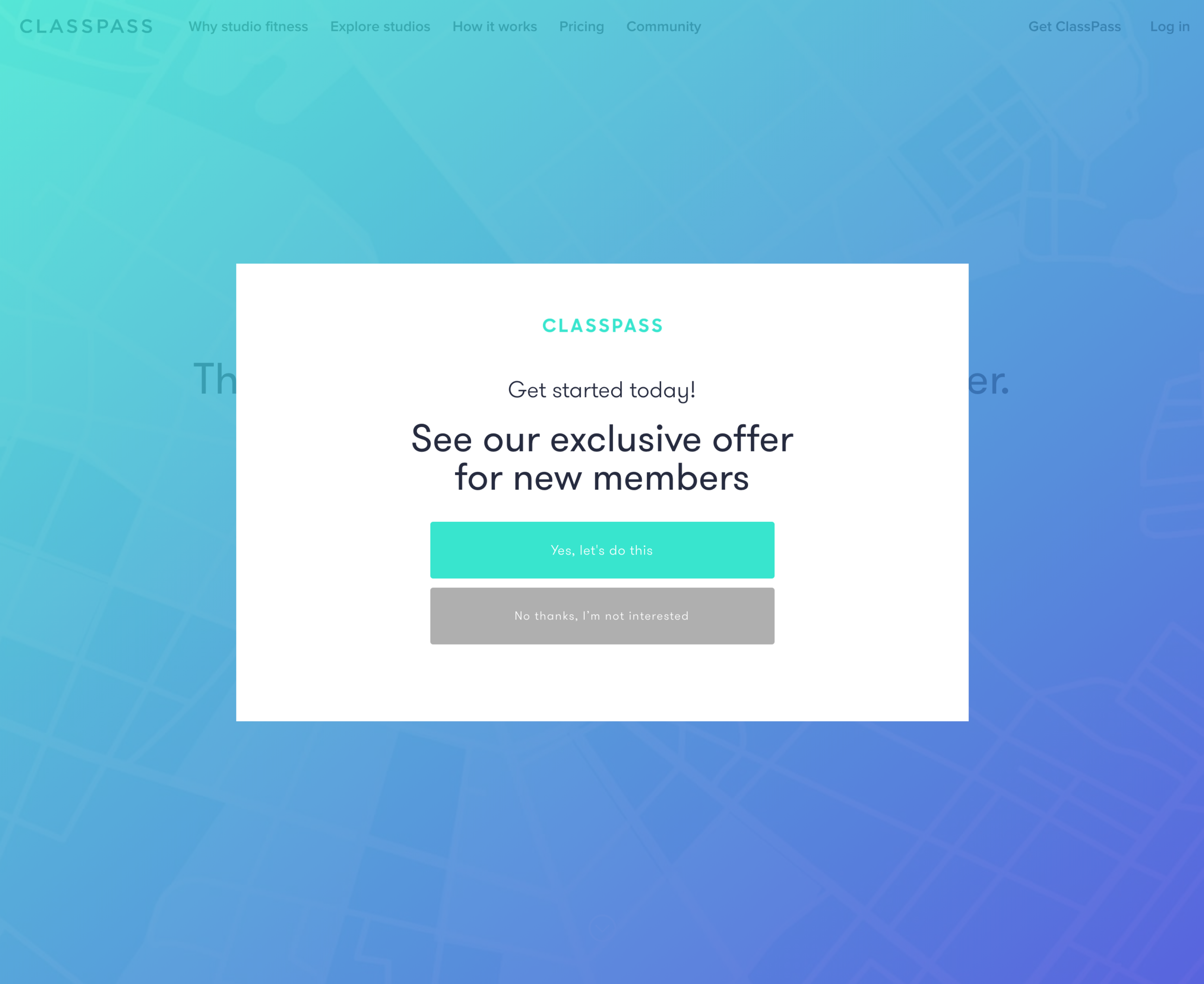
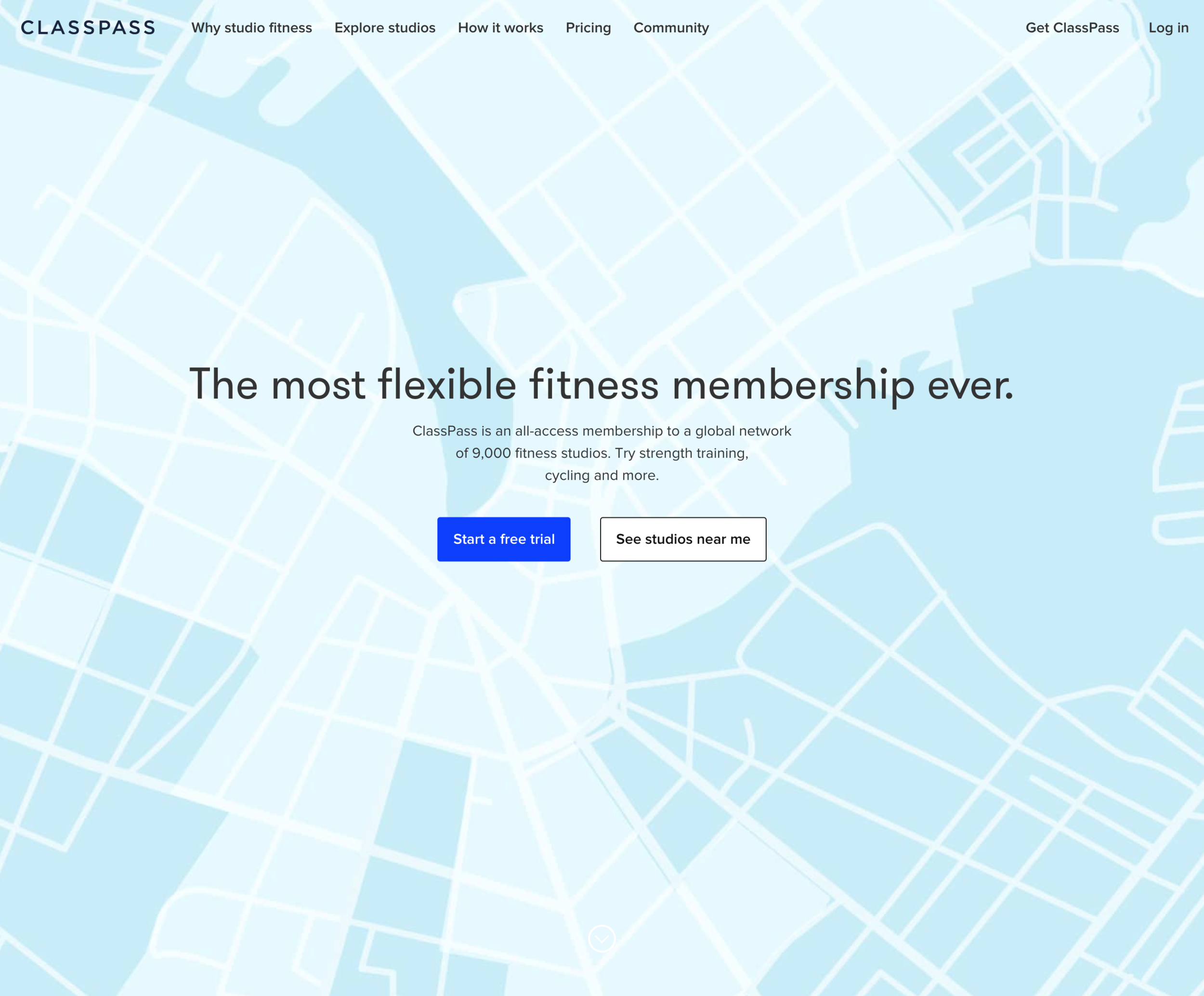
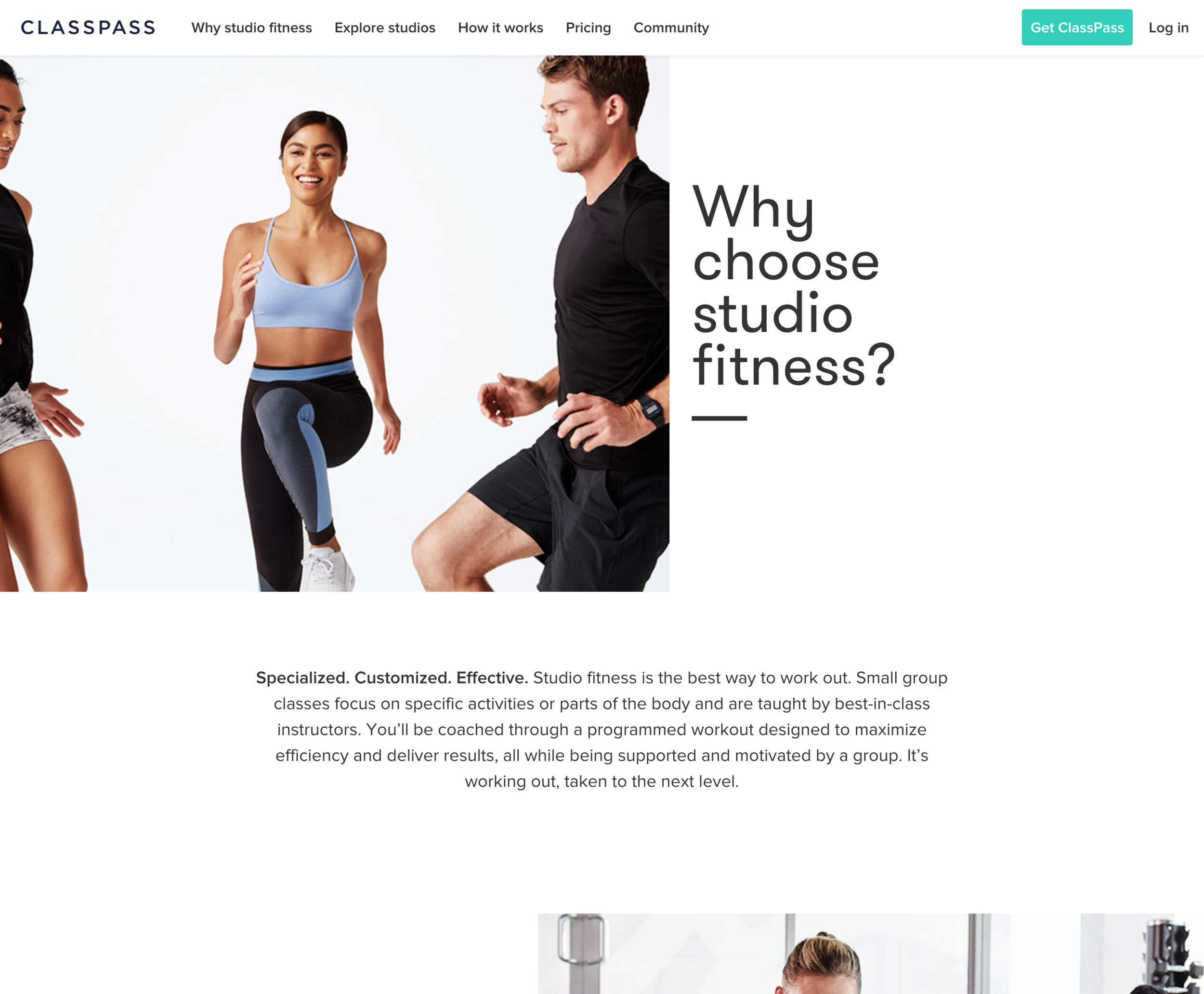
ClassPass
How do they distribute their products/services?
What are the characteristics and needs of their ideal customers?
What are the differentiating features?
What do their customers like about their business?
What marketing strategies have they employed in the past?
How is their service better/worse than ours?
What do they offer their customers?
What do their customers struggle with?
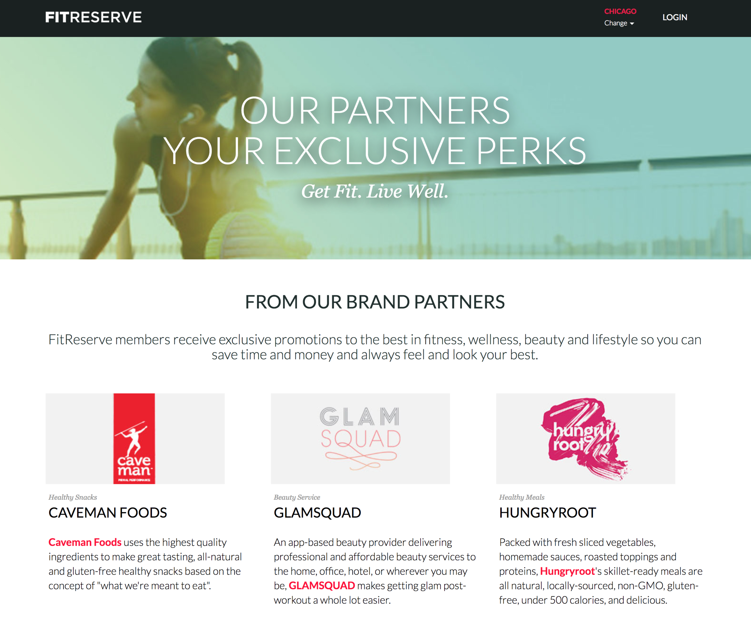
MULTI-STUDIO FITNESS
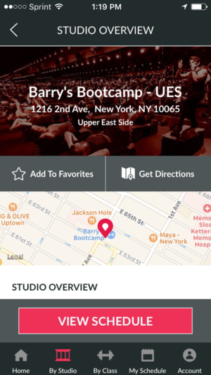
FitReserve
How do they distribute their products/services?
What are the characteristics and needs of their ideal customers?
What are the differentiating features?
What do their customers like about their business?
What marketing strategies have they employed in the past?
How is their service better/worse than ours?
What do they offer their customers?
What do their customers struggle with?
MARKET RESEARCH
Onsite Investigations
One of the benefits of a physical location for the business is a user base actively engaging with the brand. I conducted on-site research at two different schools in the Chicagoland area. I crafted a sweepstakes for the students to enter to win a free month of classes for participating in the research.
Analyzing and Using Data
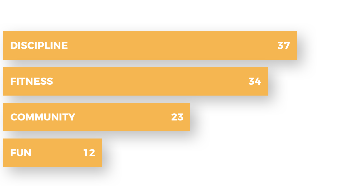
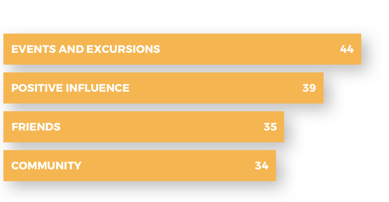
I organized the data from the onsite research and began creating personas to represent the largest categories of users. Developing personas allowed me to step outside of myself and identify who I’m interacting with, highlighting their needs, experiences, behaviors, and goals.
LYNNE NORRIS
"I want to give my children a safe environment that enriches values, but with three kids, it's hard to keep up with all of the after school activities."
Juggles three children with busy schedules
Wants her children to grow in confidence and discipline
Difficulty in getting children to go to classes
HELEN JACOBS
"I want to get involved with an active lifestyle, but my schoolwork takes a lot of time, my budget is tight, and my work schedule changes weekly."
Works unpredictable hours week to week
Thrives in environments where she can socialize and share memories with friends
Participates in a wide range of new experiences
BYRON ELLIS
"I want to push myself and be a part of a community of like-minded individuals."
Motivated by competition
Strives for physical fitness
Interested in advanced classes and training methods
Studied various martial arts for the past decade
Enjoys attending boxing matches or going out to bars with friends
ESTABLISHING NEEDS
What Matter To Our Users?
I recognized different desires each person had for the brand. I placed these inside of a Venn diagram based on common interests.
It illustrated the most valuable functions for the design of the app. Designing the app around the core needs of the users ensures that essential content is priority, and establishes that the tool will compliment and enrich the user experience.
Core Functions
Class schedules should be centralized and readily available through the use of a mobile app.
Students could save money on classes, gear, and the snack shop through exclusive discounts and promotions through an app.
Through an autopay system and push notifications, students could handle their billing electronically on mobile.
Community events could be hosted, managed, and scheduled through a system that every student has in their pocket.
MAPPING THE INTERACTIONS
User Flow
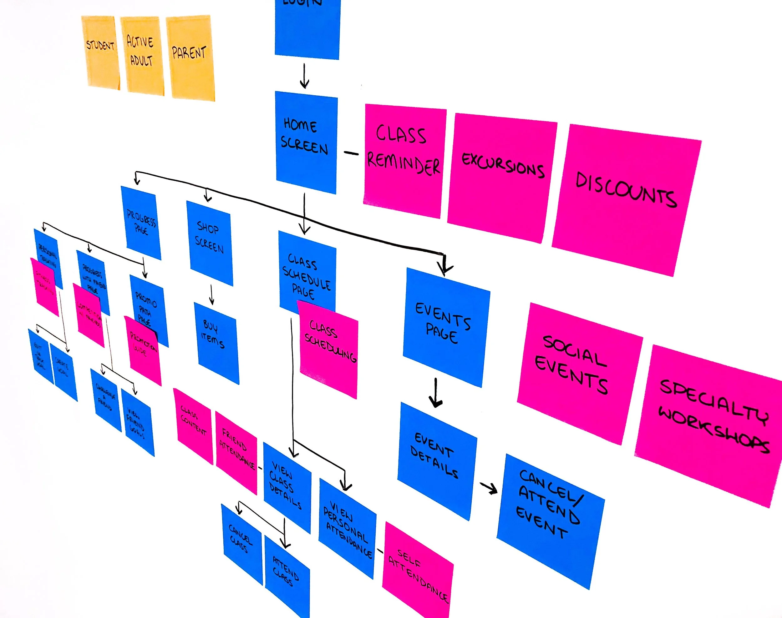
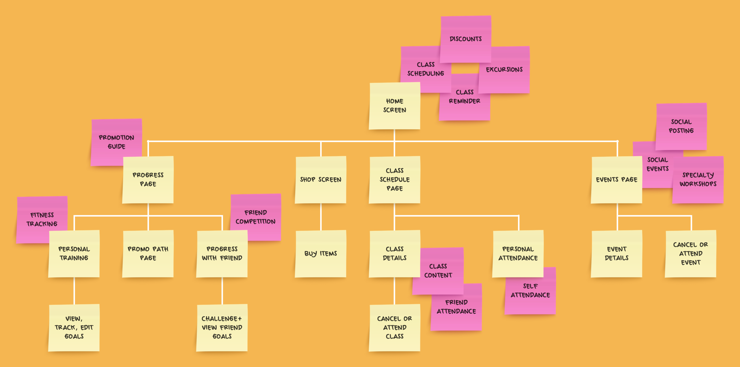
It was important to feature the interactions for core needs on the home screen. From there, I developed additional stories for different branches of the app design, each serving to satisfy one of the needs identified earlier.
WORKING WITH OUR HANDS
Wireframing
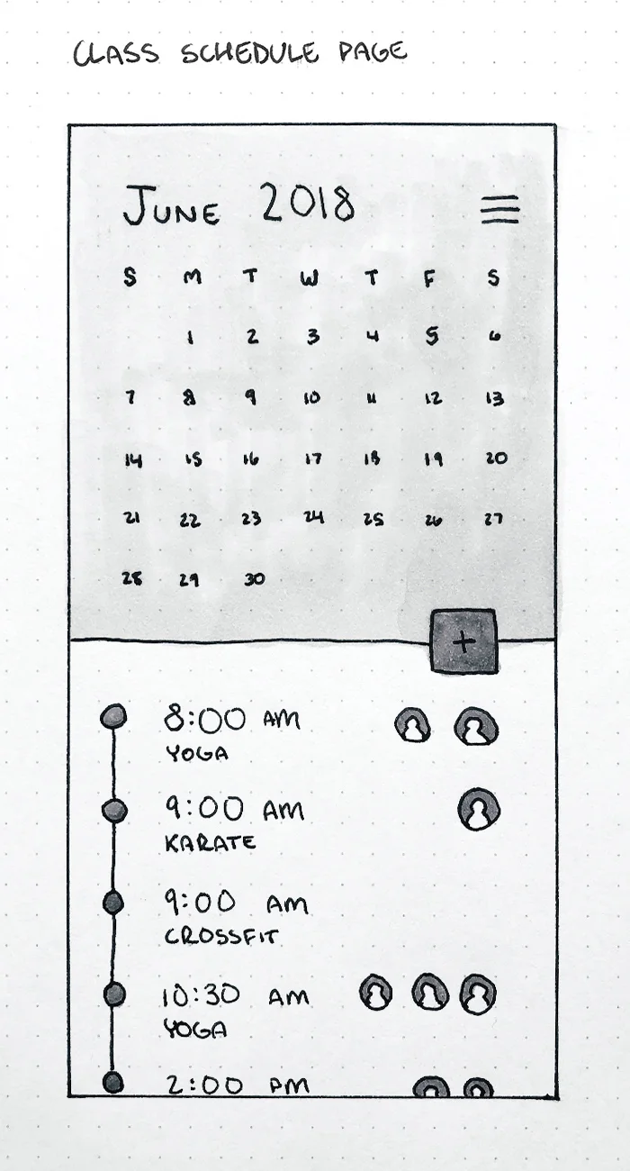
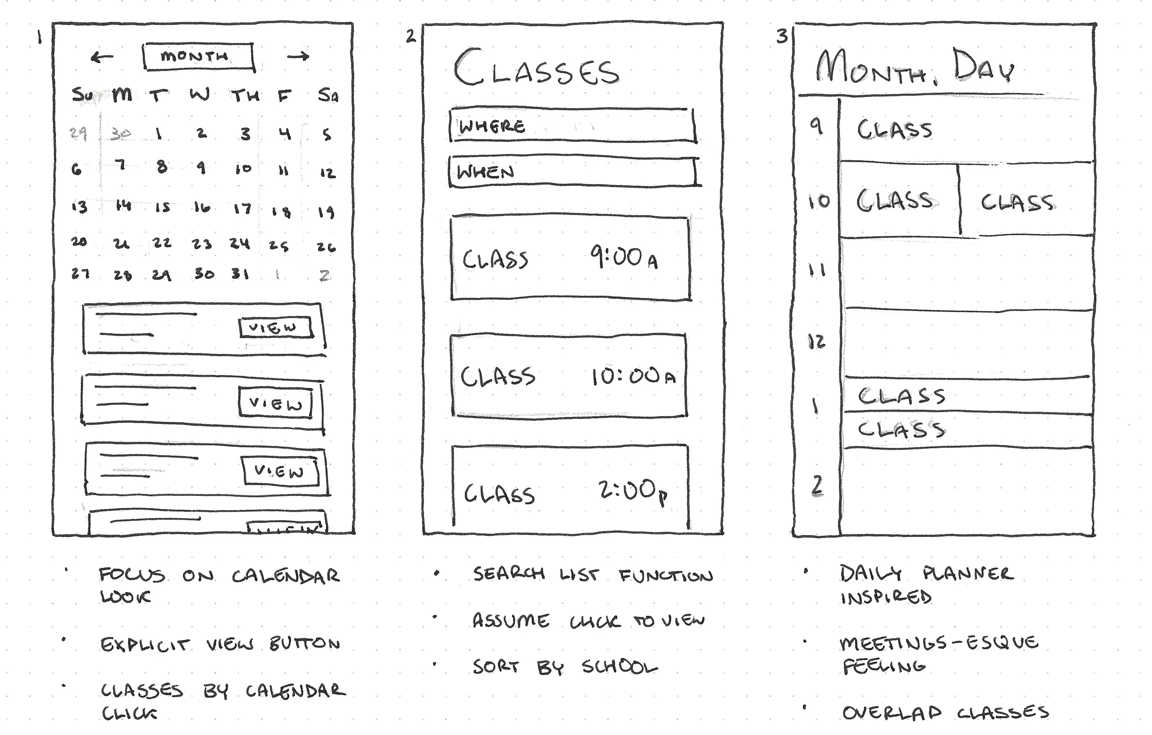
The class schedule page was one of the main features of the app, so I explored different ideas and approaches to solve the user's needs. Shown below are a handful of different avenues I considered for the design.
Class Schedule Page
There was a distinct exploration for a single page view versus a curated experience shown in sketches 5 and 6, but it was found too repetitive.
The full calendar look was appealing because students tended to focus on a whole week or the next week of classes, rather than an individual day.
One of the main struggles with the class type sorted view was that users wouldn't be encouraged to explore activities that could take the place of their usual classes.
ENDING ON HIGH NOTES
High Fidelity Mock
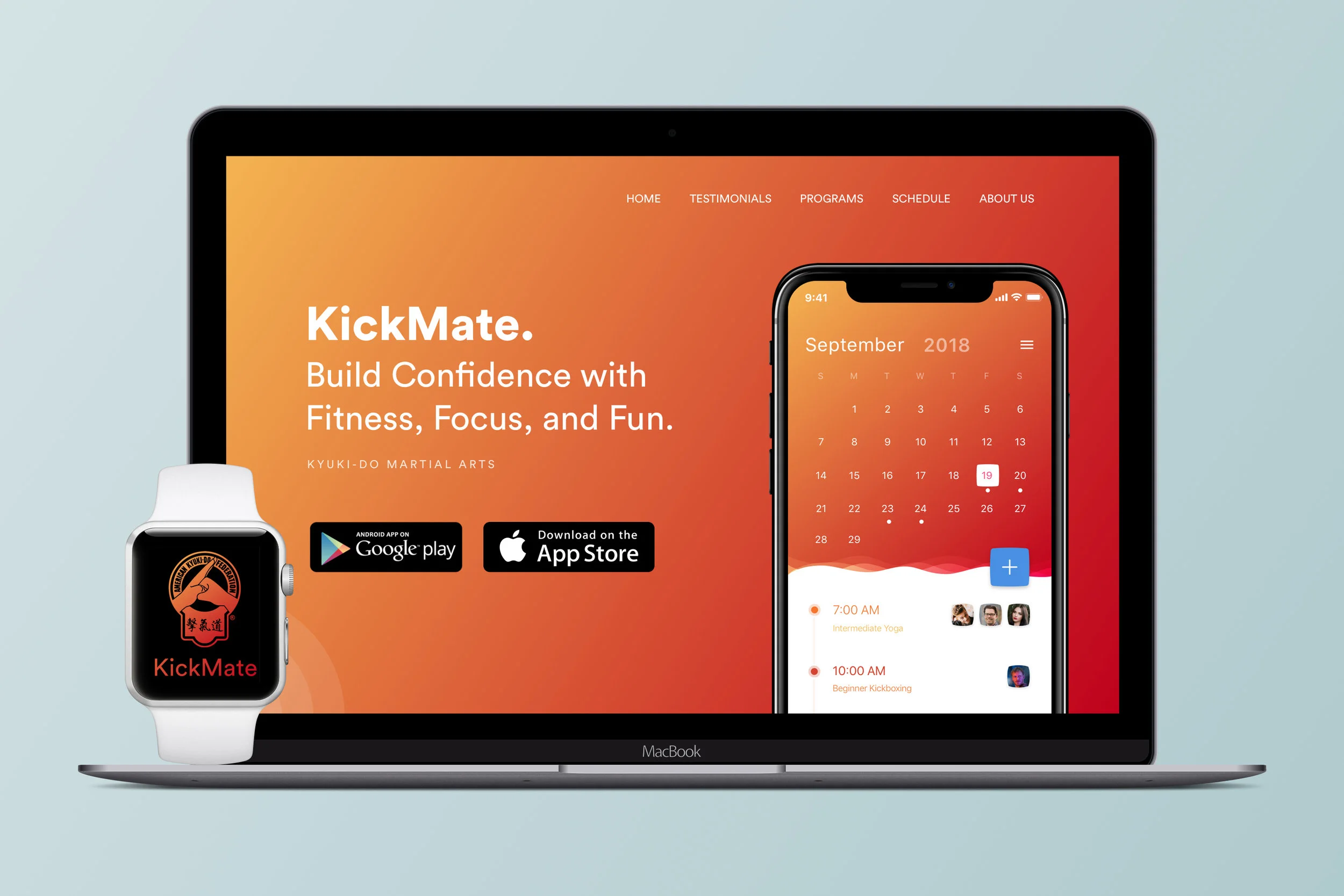
After determining the wireframe for the most essential screen, I showed a full-fidelity mock of the style and interface for the app. This would act as a keystone to guide the entire visual appearance of the rest of the app.


